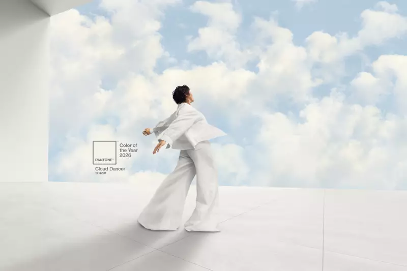
For the first time in its 26-year history, Pantone has chosen a shade of white as its Colour of the Year. The colour authority announced on Friday 5 December 2025 that 'Cloud Dancer' will define the visual mood for 2026, a selection that has ignited a fierce and divisive online debate.
A Colour Seeking Calm in a Chaotic World
Pantone explained that the hue represents a widespread longing for respite, simplicity, and a blank slate. The company positioned Cloud Dancer as a reflection of a 'transitional time' and intended it to serve as a 'calming influence in a frenetic society'. Since 1999, these annual selections have aimed to forecast the cultural zeitgeist, heavily influencing trends across fashion, interior design, and broader consumer sentiment.
The Backlash: 'Boring' and 'Tone-Deaf'
The reaction on social media and among commentators was swift and largely critical. Many derided the choice as 'boring', 'uninspired', and a 'colorless color', with some quipping 'Is the color in the room with us?' in a viral critique.

More pointedly, some observers interpreted the selection of a white shade as 'painfully tone-deaf' or even politically charged, drawing uncomfortable links to the symbolism of white nationalism. This layer of controversy has added a significant social dimension to what is typically an industry-focused announcement.
What Cloud Dancer Means for Design
Despite the controversy, Pantone's choice will undoubtedly set the agenda for designers and brands worldwide in the coming year. The push towards minimalism, purity, and a fresh start that Cloud Dancer embodies will likely manifest in everything from next season's clothing collections to homeware and graphic design. Whether the public embraces this serene vision or continues to see it as a misstep remains one of the biggest questions heading into 2026.