For over five decades, HBO's distinctive logo has been a familiar sight on television screens worldwide, yet eagle-eyed viewers have recently uncovered what appear to be subtle design inconsistencies in its modern iteration.
Social Media Sparks Design Debate
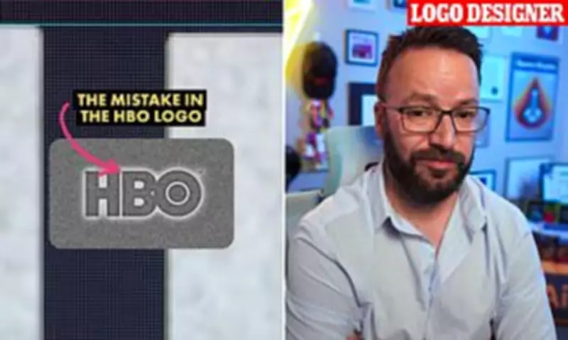
Observant fans took to social media platforms to highlight two apparent anomalies in the current HBO logo. They noted that the letter B appears positioned slightly lower than the H, while the O seems to sit marginally higher than its neighboring letters.
To the casual observer, these discrepancies are minute and easily overlooked, but once noticed, they become impossible to ignore, creating what designers call an "unseeable" visual distraction.

Professional Analysis Reveals Truth
James Barnard, an experienced logo designer who has not worked on the HBO brand, investigated these claims in detail. After downloading the official logo file and examining it using professional design software, he confirmed one genuine error while explaining the other as intentional design practice.
"When I drew measurement guides in Adobe Illustrator, the evidence was clear in black and white," Barnard told Daily Mail. "The B genuinely sits lower than the H, which represents a significant alignment error in professional design terms."
Optical Illusions Versus Genuine Mistakes
Barnard explained that the apparently higher positioning of the O letter is actually deliberate design strategy rather than a mistake. "When a circular shape aligns perfectly with straight-edged letters, an optical illusion makes it appear smaller," he clarified. "Designers compensate for this visual phenomenon using what we call 'overshoot' - extending the circle slightly beyond the baseline and cap height of adjacent letters."
He noted that while the original HBO logo featured overshoot adjustments on both the top and bottom of the O, the current version shows this correction only at the top, creating the appearance of misalignment.
Historical Context and Modern Challenges
Barnard suggested that such inconsistencies occur more frequently than consumers might realize, particularly with established brands. "With multiple designers working across various mediums over decades, companies often inherit templates containing accumulated errors," he explained. "Files get copied repeatedly, and subtle mistakes can filter through generations of designers without detection."
In HBO's case, Barnard theorized that the original hand-drawn logo from the 1970s may have suffered during its conversion to digital vector formats for modern screens. "The transition might have been rushed or handled by less experienced designers, allowing these subtle errors to persist," he suggested.
Original Designer Responds
Following Barnard's viral Instagram analysis, Gerard Huerta - the designer responsible for HBO's original 1970s logo - contacted him directly. Huerta shared the pristine, mistake-free original traced drawing, demonstrating how the logo should properly appear.
"Before digital technology dominated design, we created artwork through meticulous hand-tracing processes," Huerta explained. "We would build up drawings carefully on tracing paper, then transfer them to vellum or translucent materials for inking."
The final artwork would undergo careful cleaning before being photographed to create high-contrast prints. Huerta emphasized that while he now uses computers as tools, they serve merely for inking and coloring rather than initial design creation.
Technological Amplification of Errors
Barnard noted that while these subtle misalignments went unnoticed for years, modern display technology has made them increasingly visible. "As television screens have grown larger and resolution has improved to 8K standards, there's no longer anywhere for these errors to hide," he observed.
He also cautioned against over-reliance on artificial intelligence in design processes, suggesting that human attention to detail remains irreplaceable for creating precise, effective branding.

Public Reaction and Professional Perspective
While some social media users questioned whether such minor details warranted attention, Barnard defended the importance of design precision. "Designing effective logos is considerably more challenging than it appears," he stated. "Creating something that looks simple and effortless actually requires tremendous skill and meticulous attention to detail."
The designer acknowledged that HBO's logo has functioned successfully despite these alignment issues, but emphasized that in professional design circles, such inconsistencies matter significantly for brand integrity and visual harmony.