Primary Colours Make a Fashion Comeback: Styling Tips for Bold Hues
Primary colours—red, yellow, and blue—are back in vogue, dominating recent catwalks with their unapologetic vibrancy. Yet, despite their simplicity, these bold shades can be surprisingly challenging to wear effectively in everyday life. Unlike sophisticated neutrals or complex tones, primary colours risk appearing shouty or basic if not styled with care. This resurgence marks a shift from the muted palette that has dominated fashion for the past decade, where navy, grey, and soft pastels reigned supreme.
The Catwalk Revival of Uncomplicated Shades
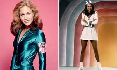
Over the last year, fashion weeks have witnessed a clear return to straightforward, primary hues. Designers are embracing colours that need no elaborate description—just red, blue, or yellow. For instance, at Celine's Paris show, models sported a rugby shirt in blue and red with a white collar, while Alaïa, known for chic black pieces, introduced a red skirt-and-top set and a yellow trench coat. Prada showcased practical jackets in cheerful yellow and green, and Loewe presented moulded dresses in pop art splashes of primary colours.
This trend reflects a move away from the nuanced shades that have long characterised high fashion, such as Armani greige or Pantone's Mocha Mousse. Instead, it celebrates the childlike simplicity of Mr Men colours, yet translating this from runway to reality requires strategic styling to avoid looking overly loud or unsophisticated.

Practical Styling Tricks for Everyday Wear
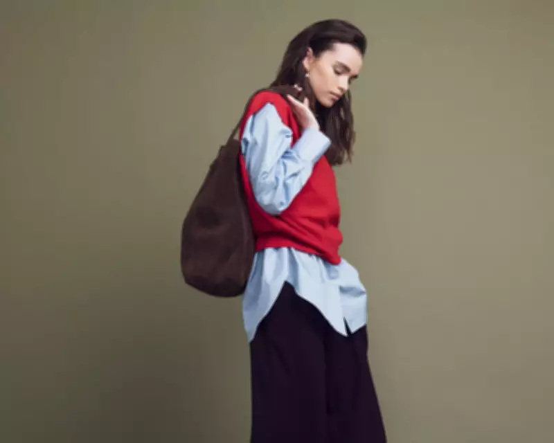
To make primary colours work in real-world settings, consider these expert tips. First, incorporate in-between colours to bridge bold hues with neutral pieces. For example, pairing a bright red knit with classic blue denim sleeves can soften the contrast against dark trousers, creating a more balanced outfit. Denim, in particular, is an excellent foil for vibrant coats or jackets, adding a touch of suaveness.
When wearing bright colours with black, ensure the black elements have dramatic flair—think leather trousers, high-waisted cuts, or extra-wide silhouettes. This prevents the outfit from feeling bland and adds intentional style. If Lego-like colours feel too attention-grabbing, try them on the bottom half, such as a bright skirt paired with a white shirt, for a bold yet sensible look.
Texture, Scale, and Accessories Matter
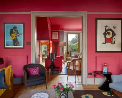
Texture plays a crucial role in tempering primary colours. Opt for materials like brushed mohair or rich crepe, which lend a grownup feel by giving the colour depth rather than letting it shout into the void. Scale is equally important; confident shapes, like generously cut sweaters, make traffic-light hues appear more deliberate compared to apologetic, neat cardigans.
For those hesitant to fully commit, accessories offer a useful entry point. Choose items with personality, such as exaggerated proportions or interesting hardware, to introduce primary colours subtly. Combining primary shades can also be effective—red and blue evoke a classic, collegiate vibe, while blue and yellow feel fresh and flattering. However, limit combinations to two colours to avoid a chaotic appearance; three is risky, and four may signal a cry for help.
Ultimately, primary colours do not have to be worn solo. With careful styling, they can enhance any wardrobe, proving that even the simplest hues can make a sophisticated statement when approached with creativity and confidence.