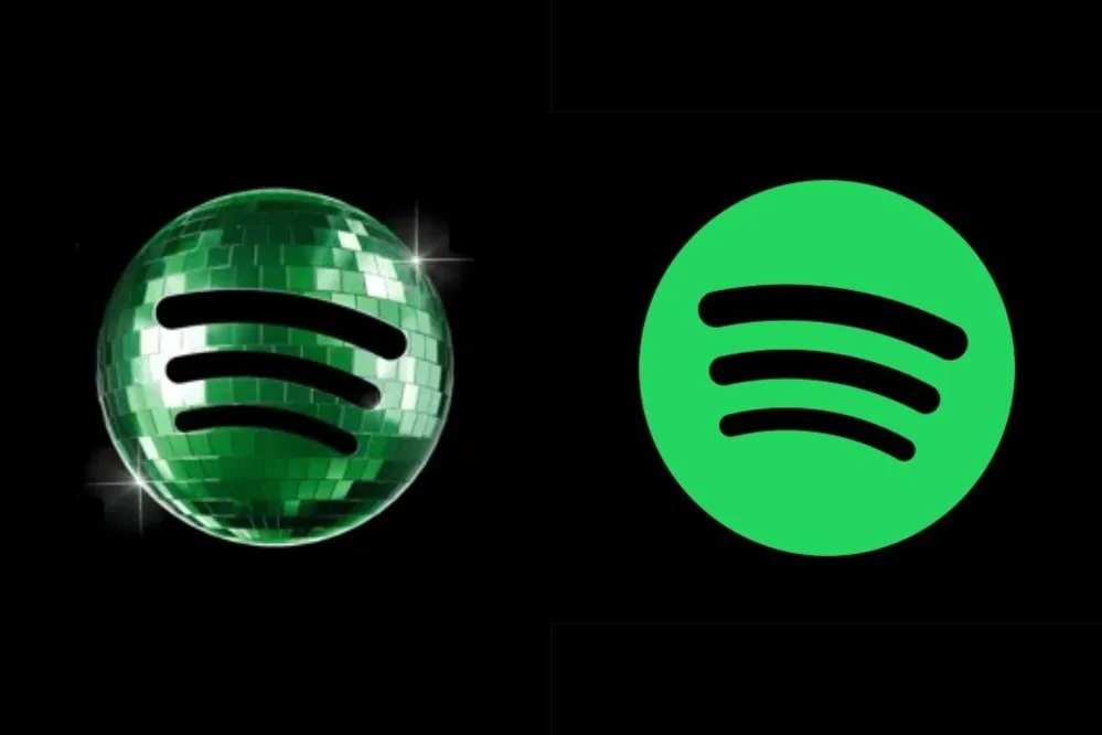
Spotify has faced a wave of backlash after introducing a temporary disco-ball icon for its mobile app on iOS, intended to celebrate its 20th anniversary. The glowing green mirrorball, part of the “Spotify 20: Your Party of the Year(s)” in-app experience, was met with criticism from users who called it an “ugly” and “pixelated” design.
The company acknowledged the negative reaction on social media, with its official account responding to complaints on Sunday (May 17). Spotify assured users that the icon is temporary and will revert to the standard 2D logo next week as originally planned.
One user on X posted: “The person who designed this logo should be fired,” while another wrote: “This new update of Spotify what the hell is this ugly app??😭✋🏽.” Spotify replied that the birthday icon was a “limited-time guest star” and that the regular icon would resume soon.

Social media consultant Jack Appleby criticised the design, citing “huge readability & brand issues” due to a darker green shade against the black background and a pixelated texture on small screens. He called it “a kinda dumb mistake.” Spotify responded: “It’s our birthday so we’re in our party gear, but we’ll be back to normal when the lights go down.”
Not all feedback was negative. Michael J. Miraflor, global EVP at WPP’s EssenceMediacom, defended the icon, saying: “Look what you’ve done, dorks. You’ve bullied Spotify into reversing something fun and different (and temporary to begin with) for their 20th Anniversary. We don’t deserve nice things.”