
How Paint Colours Can Warm Your Home in Winter and Cool It in Summer
The right paint colour can significantly influence what designers refer to as 'perceived temperature' – the subtle psychological effect that makes one room feel cosy and another airy, even if they are identical in size and heated to the same degree. This concept offers a budget-friendly way to enhance comfort without adjusting the thermostat, particularly during colder months when household budgets are under scrutiny.
Understanding the Science of Colour and Temperature
Bill Jarvis, director and paint specialist at Premium Paints, explains the underlying principle: "Warm colours visually advance, meaning they appear closer to the viewer. That subtle closeness makes walls feel nearer, which we interpret as snug and inviting. Conversely, cool colours recede, so walls appear further away, creating a sense of airiness and space."
One prevalent myth in interior design, according to Jarvis, is the assumption that darker colours automatically equate to warmth. "There is a common misconception that you need to go dark to feel cosy, but darkness and warmth are not synonymous. You can have a deep charcoal room that still feels chilly if it leans towards blue undertones."

The Critical Role of Undertones
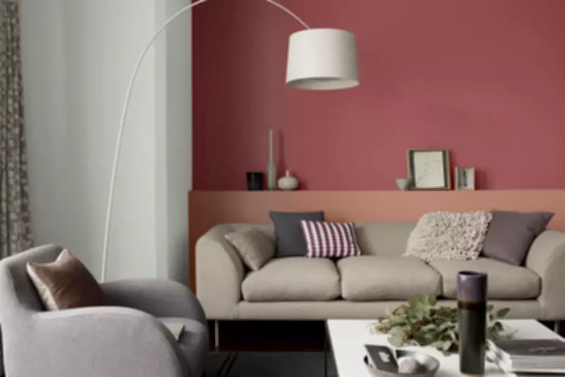
What genuinely creates warmth is the undertone – the subtle red, yellow, blue, or grey bases beneath a colour that determine how a shade behaves in different lighting conditions. "Colours with red, yellow, or brown bases produce a visual glow, even when they are pale," Jarvis notes. In practical terms, this means a creamy beige wall can feel warmer than a dark brown one.
Simon Mayhew, founder and interior designer at TXTURED, elaborates: "Warm hues like amber, terracotta, golden ochre, and deep olive contain yellow and red – colours our brains associate with fire and sunlight – which instinctively signal cosiness. Cool tones such as soft sage, chalky blue, and pale stone with grey undertones read as calmer and airier."
Mayhew emphasises the importance of selecting the appropriate paint finish to achieve the desired effect. A matt or chalky finish absorbs light, making a warm tone feel more enveloping, while an eggshell finish reflects light, preventing even a deep shade from becoming oppressive.
Adapting to Room Orientation and Seasonal Light
Considering your room's natural light is essential for creating a scheme that remains comfortable throughout the year. In the northern hemisphere, north-facing rooms are bathed in cooler, bluer daylight, so they typically benefit from warmer undertones to counteract that chill. South-facing rooms, enjoying golden, sun-filled light, can accommodate fresher palettes without feeling stark.
Helen Shaw, marketing director of paint company Benjamin Moore, advocates for mustards, terracottas, and rusts during winter because "their warm undertones instantly create a sense of comfort and cosiness." Mayhew adds that winter calls for "warm, earthy, grounded tones: golden ochres, complex beige-browns, deep spiced reds, and aged terracotta," along with "nuanced, almost mineral colours that age beautifully."
For summer, cooling a room does not necessitate stark whites. Shaw observes that while crisp white is popular, it can feel clinical in bedrooms and living spaces. Instead, softer whites with subtle grey or green undertones reflect light evenly without glare, fostering a fresher, more comfortable atmosphere. Lighter blues and greens are summer favourites; "lighter blues with green undertones offer a crisp, breezy look," Shaw explains, "without the warmth of those leaning towards indigo."
Trends and Techniques for Seasonal Transformation
A popular interiors trend seen on social media platforms like TikTok is 'colour drenching' – painting walls, ceilings, and woodwork in the same shade. This technique can dramatically intensify the perceived temperature of a room. Using deep, earthy tones creates a cocooning atmosphere ideal for winter bedrooms, while pale greens or chalky blues produce an enveloping, spa-like serenity perfect for summer.

Another swift method to transform a room is with an accent wall. A deep rust or aubergine behind a sofa, bed, or fireplace can establish a cocooning backdrop in winter, whereas swapping to eucalyptus green or sky blue in summer instantly lightens the mood – a change achievable in just a few hours.
For those seeking to alter a room without painting, the 'golden hour trick' involves hanging sheer curtains in yellow or gold. When daylight filters through, they bathe the room in a warm glow, mimicking soft sunset light and imparting a naturally cosier feel.
Layering for Flexibility and Seasonal Adaptation
Not everyone has the time or budget to repaint every six months. To shift a room's mood with the seasons, think in layers. Consider paint as a baseline that sets the overall temperature. "If you desire flexibility, avoid extreme cool or extreme warmth on large surfaces. Instead, choose a balanced neutral with a gentle undertone," advises Jarvis.
From there, adjust the atmosphere with soft furnishings, which Mayhew describes as "your seasonal lever." He adds, "This is the easiest, most affordable way to shift a room's perceived temperature without redecorating." In winter, layer a room with chunky boucle throws, velvet cushions in amber or cognac, and deep wool rugs. In summer, swap velvet for linen, wool for cotton, and move towards natural undyed fibres. "The same room can read completely differently between January and July with nothing more than a change of soft furnishings," he says.
Furniture, though more permanent, also shapes the overall tone. If replacing large pieces is impractical, introducing a slipcover or reupholstering a headboard in a seasonal shade can subtly alter the room's feel without major investment.
The Importance of Texture and Lighting
Texture matters as much as colour, sending visual cues of warmth or coolness to the brain. Wicker, velvet, and wool absorb light, adding depth and creating a sense of cosiness. Glass, linen, marble, and brushed metals reflect light, helping a space appear fresher and more open.
Lighting plays a crucial role in how colour is perceived. Cool bulbs combined with cool walls can cast a bluish evening tone that many interpret as cold, while warm bulbs paired with warm undertones enhance cosiness. "It's one of the simplest adjustments people overlook," says Jarvis. For optimal results, switch to warm white bulbs (around 2700K) in winter to amplify warmth, and neutral white bulbs (around 4000K) in summer to keep spaces feeling fresh and airy.
Crafting a Harmonious Seasonal Home
Creating a home that feels comfortable in every season need not be complicated or expensive, but it extends beyond colour alone. By thoughtfully layering paint, textiles, furniture, textures, and lighting, you can design spaces that adapt naturally to both winter and summer. As Mayhew concludes, it is about addressing every element. "The most common mistake I see is choosing a warm paint colour and filling the room with cool, hard, reflective surfaces."
He summarises: "Colour temperature is a whole-room conversation. It must run through the paint, the materials, the textiles, and the light together. Get those components working in harmony, and you will have a home that genuinely feels different to inhabit."