
iPhone enthusiasts have been left astonished by a subtle yet fascinating design quirk hidden within the device's clock application. A viral social media post has unveiled that the clock icon on the home screen behaves differently depending on the phone's power settings, revealing what some call an extraordinary attention to detail.
The Viral Discovery
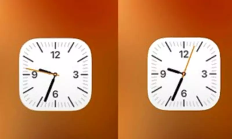
In a post that quickly gained traction on X, user @ShishirShelke1 highlighted an unusual observation about the iOS clock app icon. Typically, the second hand on the icon moves in a smooth, continuous motion around the clock face. However, when an iPhone is switched into Low Power Mode, the second hand abruptly changes to a ticking motion, mimicking the behaviour of a quartz watch rather than a mechanical one.
'Wait… the Clock icon on iOS ticks like quartz watch in low power mode and mechanical in normal mode???' @ShishirShelke1 exclaimed. 'That's ridiculous attention to detail.' The post included a visual comparison, sparking widespread discussion among Apple users who had never noticed this feature before.

Battery Saving or Design Masterstroke?
While many praised Apple for this seemingly meticulous design element, others were quick to point out a more practical explanation. One user responded, 'It's not an attention to detail, it's an easy point to save battery! When you animate the entire flow, that is more pixels having to turn on and off. When you cut each second, the pixels are doing less, saving battery life.'
This perspective aligns with Apple's own description of Low Power Mode, introduced in 2015. The feature activates when battery levels drop critically, reducing background activity to extend usage. It disables functions like email fetch, background app refresh, and automatic downloads, while also lowering display brightness and limiting refresh rates.
The Technical Explanation
Experts and users alike suggest the ticking motion is likely a byproduct of the reduced screen refresh rate in Low Power Mode. As one commenter noted, 'I think it's merely due to the refresh rate of the always on screen that goes down to 1/s.' Another added, 'It's probably not attention to detail but rather saving some battery by processing lesser frames.'
This reduction to a 1Hz refresh rate means the screen updates only once per second, causing the second hand to appear to tick rather than glide smoothly. One enthusiast remarked, 'It's even cooler than that – the screen goes down to 1Hz refresh rate. Super smart stuff,' highlighting the efficiency of Apple's power management systems.
Not the First Hidden Quirk
This discovery follows a pattern of iPhone users uncovering obscure elements within Apple's software. Last year, another viral revelation concerned the alarm app's time picker. Users found that what appears to be a circular scrolling wheel is actually an extremely long list of times. If scrolled persistently, it eventually ends at 04:39pm, a detail that left many baffled and some describing it as 'disturbing.'
These findings demonstrate the ongoing fascination with Apple's design philosophy, where even minor interface elements can become topics of intense scrutiny and debate. Whether intentional artistry or practical engineering, such features continue to engage and sometimes confuse the global community of iPhone users.